【CSS】ホワイトボードを表現【javascript】HTMLを生成
- Lorem ipsum dolor sit amet consectetur adipisicing elit.
- Lorem ipsum dolor sit amet consectetur adipisicing elit.
- Lorem ipsum dolor sit amet consectetur adipisicing elit.
HTML
<li></li>の中は、ホワイトボードに記述される内容です。
<li></li>を増やしすぎると、縦長のホワイトボードになってカッコ悪いので注意。
このHTMLをn個書けば、n個のホワイトボードが出来上がります。
   <div class="whiteBoard">
    <div class="waku">
      <ol>
        <li>任意の文字列</li>
        <li>任意の文字列</li>
        <li>任意の文字列</li>
      </ol>
    </div>
  </div>
CSS
ホワイトボード本体
  .whiteBoard {
    display: flex;
    justify-content: center;
    align-items: center;
    flex-direction: column;
    background: gray;
    margin: 20px;
    padding: 20px;
    border-radius: 20px;
  }
  .waku {
    position: relative;
    width: 90%;
    min-height: 210px;
    background: rgb(248, 248, 248);
    border-top: 8px solid #333;
    border-right: 8px solid #333;
    border-left: 8px solid #333;
    border-radius: 10px 10px 0 0;
    padding: 20px 40px;
    padding-bottom: 5%;
  }
  .uke {
    position: relative;
    width: 95%;
    height: 20px;
    background: rgb(194, 194, 194);
    border-top: solid 2px #333;
    border-left: solid 5px #333;
    border-right: solid 5px #333;
    border-bottom: solid 5px #333;
    border-radius: 0 0 10px 10px;
  }
  .uke::before {
    content: "";
    position: absolute;
    top: -5px;
    left: -5px;
    width: 3%;
    height: 5px;
    background: #333;
  }
  .uke::after {
    content: "";
    position: absolute;
    top: -5px;
    right: -5px;
    width: 3%;
    height: 5px;
    background: #333;
  }
箇条書き部分
  ol {
    counter-reset: number-ol;
  }
  li {
    position: relative;
    width: 95%;
    list-style: none;
    color: #333;
    margin-bottom: 1em;
  }
  ol li::before {
    counter-increment: number-ol;
    content: counter(number-ol);
    position: absolute;
    top: 1px;
    left: -25px;
    background: #ff0000;
    font-size: 14px;
    color: #fff;
    border-radius: 50%;
    line-height: 20px;
    width: 20px;
    text-align: center;
    text-indent: 0;
  }
参考
黒板消し、ペン
  .keshi {
    position: absolute;
    bottom: 10px;
    right: 10%;
    background: orange;
    width: 80px;
    height: 20px;
    border-radius: 15px 15px 0 0;
  }
  .keshi::before {
    content: "";
    position: absolute;
    bottom: -60%;
    right: 0;
    width: 100%;
    height: 60%;
    background: green;
  }
  .keshi::after {
    content: "";
    position: absolute;
    bottom: 0;
    right: 50%;
    transform: translateX(50%);
    width: 30%;
    height: 100%;
    background: rgb(161, 67, 0);
  }
  .pen {
    position: absolute;
    top: 135px;
    right: 10px;
    width: 10px;
    height: 60px;
    background: blue;
    border-radius: 0 0 3px 3px;
    transform: rotate(-10deg);
  }
  .pen::before {
    content: "";
    position: absolute;
    top: -21px;
    width: 2px;
    border-left: 4px transparent solid;
    border-right: 4px transparent solid;
    border-bottom: 20px solid #333;
  }
参考
マグネットと光
  .mag-blue,
  .mag-yellow,
  .mag-red {
    position: absolute;
    background: blue;
    top: 10px;
    right: 3px;
    width: 30px;
    height: 30px;
    border-radius: 50%;
  }
  .mag-yellow {
    top: 45px;
    background: rgb(202, 202, 0);
  }
  .mag-red {
    top: 80px;
    background: red;
  }
  .mag-light {
    position: absolute;
    width: 10px;
    height: 5px;
    background: #fff;
    transform: rotate(-40deg);
    border-radius: 30%;
    filter: blur(2px);
  }
  .light1 {
    width: 7px;
    height: 3px;
    top: 17px;
    left: 3px;
  }
  .light2 {
    top: 11px;
    left: 2px;
  }
  .light3 {
    top: 8px;
    left: 3px;
  }
  .light3 {
    top: 7px;
    left: 4px;
  }
  .light4 {
    top: 5px;
    left: 12px;
  }
  .mag-blue .light5,
  .mag-yellow .light5,
  .mag-red .light5 {
    position: absolute;
    width: 20px;
    height: 20px;
    top: 20%;
    left: 18%;
    border-radius: 50px;
    filter: blur(2px);
  }
  .mag-blue .light5 {
    background: blue;
  }
  .mag-yellow .light5 {
    background: rgb(202, 202, 0);
  }
  .mag-red .light5 {
    background: red;
  }
レスポンシブ
  @media (max-width: 480px) {
    .whiteBoard{
      margin: 20px 5px;
    }
    .waku {
      padding: 10px 20px 10px 30px;
    }
    li {
      font-size: 14px;
    }
    .mag-blue,
    .mag-yellow,
    .mag-red {
      transform: scale(0.5);
    }
    .mag-yellow{
      top: 30px;
    }
    .mag-red{
      top: 50px;
    }
    .pen {
      top: 80px;
      transform: rotate(-10deg) scale(0.5);
    }
  }
javascript
HTMLを生成する関数
  function setHtml(a, b) {
    const pen = document.createElement("pen"),
      keshi = document.createElement("div"),
      mag1 = document.createElement("div"),
      mag2 = document.createElement("div"),
      mag3 = document.createElement("div"),
      uke = document.createElement("div");
    pen.classList.add("pen");
    keshi.classList.add("keshi");
    mag1.classList.add("mag-blue");
    mag2.classList.add("mag-yellow");
    mag3.classList.add("mag-red");
    uke.classList.add("uke");

  for (let i = 0; i < 3; i++) {
    if (i == 0) {
        magLight(mag1);
      }
      if (i == 1) {
        magLight(mag2);
      }
      if (i == 2) {
        magLight(mag3);
      }
    }

  a.appendChild(keshi);
  a.appendChild(pen);
    a.appendChild(mag1);
    a.appendChild(mag2);
    a.appendChild(mag3);
    b.appendChild(uke);
  }
マグネットの光沢を表現する要素を生成する関数
  function magLight(obj) {
    for (let j = 0; j < 5; j++) {
      const light = document.createElement("div");
      light.classList.add("mag-light", `light${j + 1}`);
      obj.appendChild(light);
    }
  }
HTMLをn個分生成
  const whiteBoard = document.querySelectorAll(".whiteBoard"),
    waku = document.querySelectorAll(".waku");

  for (let i = 0; i < whiteBoard.length; i++) {
    setHtml(waku[i], whiteBoard[i]);
  }
- ホワイトボードをCSSで表現してみました。
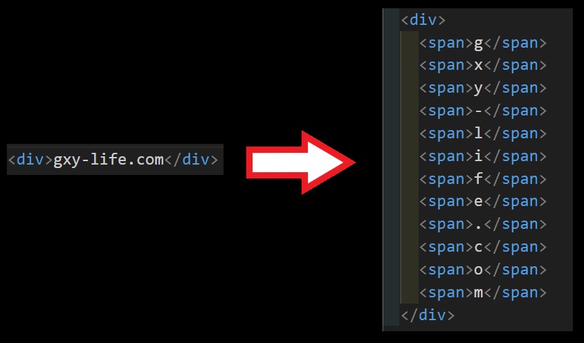
- javascriptでHTMLを生成することにより、n個のホワイトボードを作っても、 コードをスッキリさせることができました。
- 全体のコードはこちらからダウンロードできます。
こんな記事も読まれています。
-

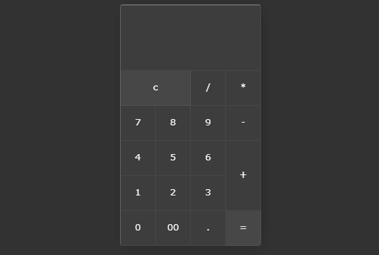
【HTML】【CSS】【javascript】電卓の作り方
電卓のソースコードを2つ紹介します。javascriptはわずか数行で書けます。
-
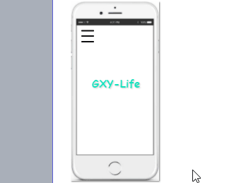
【JacvaScript】【CSS】たった4行のJavaScriptでできるハンバーガーメニューの作り方
たった4行のJavaScriptで作るハンバーガーメニューの作り方について紹介します。✖をつくるには、transform-originがポイントです。
- リンク
-
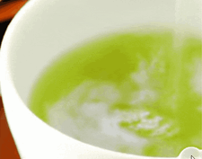
波紋エフェクトを表現するjqueryのripples-min.jsの使い方
jqueryのripples-min.jsを使うと簡単に水面の波紋を表現できます。波紋の広がりの速度、波紋の大きさ、波紋のブレの値を変えていろいろ表現させると面白いです。
-
【Javascript】querySelectorAllで要素を取得し、クリックしたら、クラスを追加したり、削除したりする方法。
JavascriptのquerySelectorAllで要素を取得し、クリックしたら、クラスを追加したり、削除したりする方法について解説します。querySelectorと同じように書いてしまうとエラーがでます。forEachを使うとすべてに適用できます。
- リンク
-
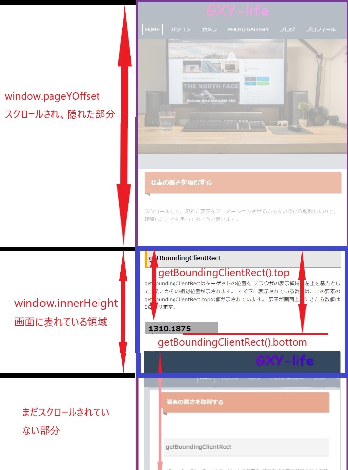
要素の高さを取得する方法。getBoundingClientRectとは?window.innerHeightとは?window.pageYOffsetとは?
要素の高さを取得する方法について解説します。getBoundingClientRect、window.innerHeight、window.pageYOffsetについて理解し、要素がいつ画面に現れるかを把握できるようにしましょう。
-
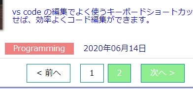
Javascriptを使ったページネーションの実装
トップページの記事が増えてきたので、何とかページネーションで最新の記事だけを表示できないかと思っていたら、いい記事を発見しました。カスタマイズして実装することができました。
- リンク
-
【Javascript】マウスの指す(X, Y)座標とドラッグ & ドロップを理解する
マウスの指す(X, Y)座標とドラッグ & ドロップについて解説します。mousedown, mouseover, mousemove, mouseupを使います。
-
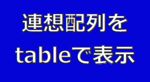
【javascript】連想配列をテーブルできれいに表示する方法
javascript(Object.entries)を使って、連想配列の中身をテーブルできれいに表示する方法について紹介します。
- リンク