【CSS】画像(サムネイル)の上のテキストを疑似要素を使って見やすくする方法 background: linear-gradient
やりたいこと
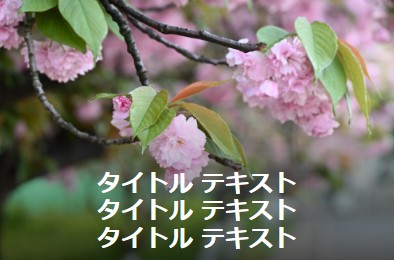
以下のsample1を見てください。画像の上に文字をのせた時、背景画像の色と文字の色が近いと 文字がよく見えません。そこで、文字を見やすくするために、疑似要素を使って、薄く影を入れ、文字を見やすくさせたいと思います。
疑似要素で影を作る方法
sample2~5までの影のつけ方を紹介します。
HTML
<div class="thumbnail thumbnail1"></div>
<div class="thumbnail thumbnail2"></div>
<div class="thumbnail thumbnail3"></div>
<div class="thumbnail thumbnail4"></div>
共通部分
.thumbnail {
  max-width: 400px;
  position: relative;
  margin-bottom: 20px;
  border: dotted 1px #666;
}
.thumbnail::before {
  content: "";
  position: absolute;
  width: 100%;
  height: 100%;
  top: 0;
  left: 0;
}
sample2
sample2は全体に影を作っています。文字以外の画像がちょっと暗くなってしまいます。
.thumbnail1::before {
  background: rgba(0, 0, 0, 0.2);
}
sample3
sample3は中央に影を作っています。
 .thumbnail2::before {
  background: linear-gradient(
    0deg,
    rgba(0, 0, 0, 0) 0%,
    rgba(0, 0, 0, 0.4) 30% 70%,
    rgba(0, 0, 0, 0) 100%
  );
}
sample4
sample4は下半分に影を作っています。
.thumbnail3::before {
  background: linear-gradient(
    0deg,
    rgba(0, 0, 0, 0.7),
    rgba(0, 0, 0, 0) 60%,
    rgba(0, 0, 0, 0)
  );
}
sample5
sample5は上半分に影を作っています。
.thumbnail4::before {
  background: linear-gradient(
    0deg,
    rgba(0, 0, 0, 0),
    rgba(0, 0, 0, 0) 40%,
    rgba(0, 0, 0, 0.7)
  );
}
画像とテキストを追加
sample2
sample2だけ、すべてのコードを書いておきます。その他は、ページ下部のダウンロードボタンからダウンロードしてください。
タイトル テキスト
タイトル テキスト
タイトル テキスト
<div class="wrapper">
  <div class="thumbnail thumbnail1">
    <div class="text-wrapper1">
      <span class="title1">タイトル テキスト</span>
      <span class="title2">タイトル テキスト</span>
      <span class="title3">タイトル テキスト</span>
    </div>
  </div>
</div>

<style>
  .wrapper .thumbnail {
    width: 100%;
    max-width: 400px;
    aspect-ratio: 3 / 2;
    background: url(画像のURLを入力);
    position: relative;
    background-size: cover;
    background-position: 0%;
    margin-bottom: 20px;
    color: #fff;
    font-size: 1.5em;
    font-weight: bold;
    border: dotted 1px #666;
  }
  .thumbnail::before {
    content: "";
    position: absolute;
    width: 100%;
    height: 100%;
    top: 0;
    left: 0;
  }
  .thumbnail1::before {
    background: rgba(0, 0, 0, 0.2);
  }
  [class^="text-wrapper"] {
    position: absolute;
    width: 100%;
    padding: 10px;
    display: flex;
    justify-content: center;
    align-items: center;
    flex-direction: column;
  }
  .text-wrapper1 {
    top: 50%;
    left: 50%;
    transform: translate(-50%, -50%);
  }
</style>
sample3
タイトル テキスト
タイトル テキスト
タイトル テキスト
sample4
タイトル テキスト
タイトル テキスト
タイトル テキスト
sample5
タイトル テキスト
タイトル テキスト
タイトル テキスト
参考
「^=」の意味とは?
ページ内リンクのスムーススクロールやCSSの指定などに使えます‼
まとめ
- 疑似要素で影を作り、テキストを見やすくする。
- background: linear-gradientで影を作る。