CSS初級 超基礎 これだけは覚えたいプロパティ
CSSとは?
Cascading Style Sheets
Cascading : 重ねる
Style Sheets : 文章などの表示形式を制御する仕組み
⇒ HTMLの見た目を整える、修飾する
CSSの書き方
HTML<head>
<style>
h1 {
color: blue;
}
h2 {
color: orange;
}
p {
color: red;
}
</style>
</head>
<body>
<h1>プログラミング入門</h1>
<h2>HTMLとは?</h2>
<p>Hyper Text Markup Language</p>
</body>結果
プログランミング入門
HTMLとは?
Hyper Text Markup Language
CSS ロードマップ
文字の装飾
共通HTML
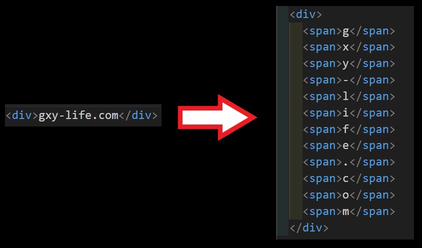
HTML<div> Lorem ipsum dolor sit
amet consectetur adipisicing elit.
Fugiat numquam officia recusandae delectus nulla consequatur mollitia,
iusto minima perspiciatis nam dolores dignissimos,
quisquam cum eaque itaque iste sit necessitatibus nisi.
</div>色 : color
CSS div {
color: red;
}文字の大きさ : font-size
CSS div {
color: red;
font-size: 22px;
}行の高さ : line-height
CSS div {
color: red;
font-size: 22px;
line-height: 25px;
}文字の太さ : font-weight
CSS div {
color: red;
font-size: 22px;
line-height: 25px;
font-weight: bold;
}幅と高さ
width と height
px(ピクセル)、または、%(パーセント)で指定
CSSdiv {
width: 400px;
height: 200px;
/* または */
width: 50%;
height: 20%;
color: red;
font-size: 22px;
line-height: 25px;
font-weight: bold;
}背景
background
CSSdiv {
width: 400px;
height: 200px;
background: yellow;
color: red;
font-size: 22px;
line-height: 25px;
font-weight: bold;
}背景画像を表示させる
CSSdiv {
width: 400px;
height: 200px;
background-image: url("./img/cat.jpg");
background-size: cover;
color: red;
font-size: 22px;
line-height: 25px;
font-weight: bold;
}文字の配置
text-align
CSSdiv {
width: 400px;
height: 200px;
background: yellow;
color: red;
font-size: 22px;
line-height: 25px;
font-weight: bold;
text-align: center; /* 中央揃え */
text-align: left; /* 左寄せ */
text-align: right; /* 右寄せ */
}枠線
border
border: 線の太さ 線の種類 線の色
CSSdiv {
width: 400px;
height: 200px;
background: yellow;
color: red;
font-size: 22px;
line-height: 25px;
font-weight: bold;
text-align: center; /* 中央揃え */
border: 1px solid black;
}線の種類
外側の余白
margin
CSSdiv {
width: 400px;
height: 200px;
background: yellow;
margin: 50px;
color: red;
font-size: 22px;
line-height: 25px;
font-weight: bold;
text-align: center; /* 中央揃え
border: 1px solid black;
}その他の設定
CSS div {
margin: 50px 100px 150px 200px;
/* margin: 上 右 下 左*/
margin: 50px 200px;
/* margin: 上下 左右*/
margin: 50px auto;
/* margin: 上下 左右中央寄せ*/
}内側の余白
padding
CSS div {
width: 400px;
height: 400px;
background: yellow;
padding: 30px;
color: red;
font-size: 22px;
line-height: 25px;
font-weight: bold;
text-align: center; /* 中央揃え
border: 1px solid black;
}その他の設定
CSS div {
margin: 20px 30px 50px 60px;
/* margin: 上 右 下 左*/
margin: 30px 50px;
/* margin: 上下 左右*/
}hover
マウスが
<style>
  .box{
    width: 400px;
    height: 200px;
    background: blue;
  }
  .box:hover{
    background: red;
  }
</style>

<div class="box"></div>
transition
遷移
HTML
<style>
    .box{
      width: 400px;
      height: 200px;
      background: blue;
      transition: 0.5s ease;
    }
    .box:hover{
      background: red;
    }
  </style>

  <div class="box"></div>
transform
変形
translate
HTML<style>
.box3{
width: 400px;
height: 200px;
background: blue;
transition: .5s ease;
}
.box3:hover{
transform: translate(50px, 50px);
}
/* transform: translate(X軸, Y軸) */
</style>
<div class="box3"></div>rotate
HTML<style>
.box3, .box4{
width: 400px;
height: 200px;
background: blue;
transition: .5s ease;
}
.box4:hover{
transform: rotate(360deg);
}
</style>
<div class="box4"></div>scale
HTML<style>
.box3, .box4, .box5{
width: 400px;
height: 200px;
background: blue;
transition: .5s ease;
}
.box4:hover{
transform: scale(1.5);
}
</style>
<div class="box5"></div>overflow
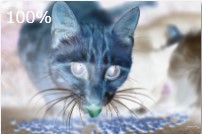
hidden (はみ出た部分 を隠 す)
HTML
<style>
    .img{
      width: 600px;
      height: 380px;
      overflow: hidden;
    }
    img{
      transition: 0.3s ease;
    }
    img:hover{
      transform: scale(1.3);
    }
</style>

<div class="img">
    <img src="./img/cat.jpg" alt="ネコ">
</div>
scroll (はみ出た部分をスクロールさせる)
HTML<style>
.outer{
width: 300px;
height: 200px;
overflow: scroll;
}
.inner{
width: 1000px;
height: 1000px;
background: blue;
}
</style>
<div class="outer">
<div class="inner">
Lorem ipsum dolor sit amet consectetur adipisicing elit. Nihil, fuga
quas dolor eum rerum, quis libero cumque qui voluptates quibusdam
culpa tempore fugiat officia possimus nulla voluptatem sed?
Voluptate, aut.
</div>
</div>display
インライン要素をブロックレベル要素に変更
HTML<style>
span{
height: 50px
background: red;
color: #fff;
}
</style>
<span>span1</span>
<span>span2</span>
<span>span3</span>結果
display: block;を追加
span{
  display: block;
  height: 50px
  background: red;
  color: #fff;
}
結果
縦並びになり、横幅いっぱいになり、高さも50pxになる。
インラインブロック(inline-block)
インラインブロックはインライン要素とブロックレベル要素の良いところ取り。
span{
  display: inline-block;
  height: 50px
  background: red;
  color: #fff;
}
結果
横並びになり、幅と高さが設定できる。
flexbox フレックスボックス
display: flexでレイアウトができる。
<style>
  .flex{
    width: 500px;
    height: 200px;
    border: 1px solid black;
  }
  .flex-box{
    width: 100px;
    height: 50px;
    border: 1px solid black;
  }
</style>

<div class="flex">
  <div class="flex-box">1</div>
  <div class="flex-box">2</div>
  <div class="flex-box">3</div>
</div>
結果
親要素にdisplay: flexを追加
.flex{
    display: flex;
    width: 500px;
    height: 200px;
    border: 1px solid black;
  }
  .flex-box{
    width: 100px;
    height: 50px;
    border: 1px solid black;
  }
結果
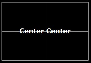
justify-content 水平方向の配置
justify-contentで水平方向の配置ができる。
.flex{
    display: flex;
    justify-content: center;
    width: 500px;
    height: 200px;
    border: 1px solid black;
  }
結果
| flex-start | 左寄せ |
|---|---|
| center | 中央寄せ |
| flex-end | 右寄せ |
| space-around | 中央に均等寄せ |
| space-between | 左右に配置し、中身を均等にする |
align-items 垂直方向の配置
align-itemsで垂直方向の配置ができる。
.flex{
  display: flex;
  justify-content: center;
  align-items: center;
  width: 500px;
  height: 200px;
  border: 1px solid black;
}
結果
| flex-start | 左寄せ |
|---|---|
| center | 中央寄せ |
| flex-end | 右寄せ |
折り返し flex-wrap:wrap
HTML<div class="flex">
<div class="flex-box">1</div>
<div class="flex-box">2</div>
<div class="flex-box">3</div>
<div class="flex-box">4</div>
<div class="flex-box">5</div>
</div>.flex{
display: flex;
width: 500px;
height: 200px;
border: 1px solid black;
}
.flex-box {
width:200px
}結果
横並び1列で、横幅が効いていない。(widthが200pxになっていない)
親要素にflex-wrap: wrapを追加。
.flex{
    display: flex;
    flex-wrap: wrap;
    justify-content: center;
    align-items: center;
    width: 500px;
    height: 200px;
    border: 1px solid black;
}position
| static | 通常の位置で配置される(初期値) |
|---|---|
| relative | 通常の位置を基準に相対位置を指定 |
| absolute | body、または親要素を基準に絶対位置を指定 |
| fixed | ウィンドウを基準に絶対位置を指定 |
relative
要素にposition: relativeを指定することにより、 その場所からの、相対位置を指定することができる。
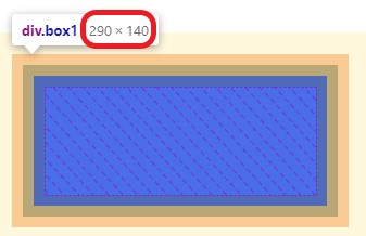
  <div class="wrapper">
    <div class="box1"></div>
    <div class="box2"></div>
    <div class="box3"></div>
</div> .wrapper{
display: flex;
justify-content: space-between;
border: 1px solid #333;
height: 100px;
}
.wrapper .box1,
.wrapper .box2,
.wrapper .box3 {
width: 80px;
height: 40px;
background: blue;
}
.wrapper .box2{
position: relative;
top: 40px;
left: 80px;
}もともとあった場所から、top,leftで位置を指定できる。
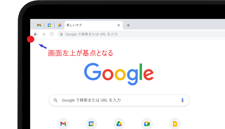
absolute
画面の左上を基点として、絶対位置を指定できる。
親要素を基点とする
親要素にposition: relativeを指定することにより、 親要素の左上を基点として、絶対位置を指定できる。
  <div class="oya">親要素
    <div class="ko">子要素</div>
</div> .oya{
position: relative;
height: 200px;
}
.ko{
position: absolute;
padding: 15px;
height: 140px;
width: 80%;
}left: px
fixed
画面左上からの位置を指定し、スクロールしても その位置を動かずに留まる。

こんな記事も読まれています。
-

【CSS】box-sizing: border-boxとは?指定するメリットは?
CSSのbox-sizing: border-boxについて解説します。指定することによりレイアウトしやすくなります。また、親要素からはみ出すことも防げます。
-
【CSS】box-sizing: border-boxとは?指定するメリットは?
CSSのflexboxで上下左右、中央の配置の方法について説明します。justify-contentで左右の配置を、align-itemsで上下の配置を決めます。flex-start,center,flex-endの使い方。
- リンク
-
【CSS】transformのrotateとtransform-originについて。回転させる基点を変える
CSSのrotateについて解説します。指定によりZ軸、X軸、Y軸で回転させます。またtarnsform-originを指定することにより、回転する基点を移動させることができます。
-
【CSS】filterの使い方 画像をぼかしたり、色の変化を適用させる
【CSS】filterの使い方について解説します。画像をぼかしたり、色の変化を適用させるには? brightness、contrast、drop-shadow、grayscale、hue-rotate、invert、saturate、sepiaの設定方法
- リンク
-
【CSS】perspective と transform-style で3D表現。立方体を作ってみよう。
CSSのperspectiveとtransform-styleについて解説します。CSSだけで3Dを表現できます。立方体をつくり、それを応用する方法も紹介します。
-
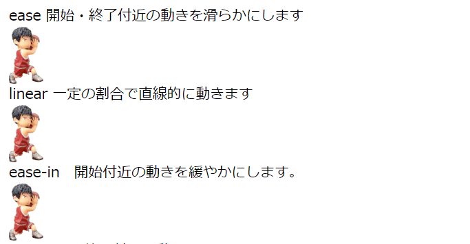
【CSS】animation パート2 アニメーションの動き(time-function),遅延時間(delay),方向(direction)について
【CSS】animation のアニメーションの動き(time-function),遅延時間(delay),方向(direction)について解説します。。
- リンク
-
【css】grid-templateでtwitter風に画像を表示させる方法
grid-templateを使えば、画像を思い通りに配置できます。twitter風に画像を表現することができます。
-
リンク
-
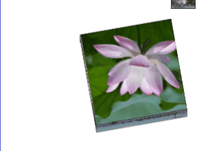
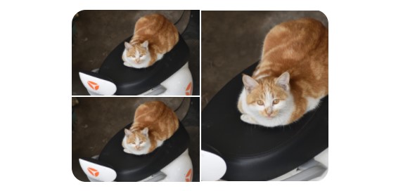
【CSS】マウスを乗せた(ホバーした)時、サムネイル画像を拡大・縮小する方法
CSSでマウスをホバーした時、サムネイル画像を拡大・縮小する方法。overflow: hiddenやtransform: scale();を使い、拡大、縮小させます。